 NFT Collections")

Again n again@Joseinnewworld is back!
— Gaexe (@gaexe_) May 28, 2025
Thankyou for sweeping several of my #NFTs! 🙌
Your support means everything. Enjoy the perks, flex your collectible, and unlock the full Gaudio experience. 🎧💎 #eCash $XEC #BlockchainFuture #NFTdrop pic.twitter.com/k9alX2Szm1
The material design team at Google simply defines the functionality of tabs in Android as follows:
Tabs make it easy to browse and switch between different views.
In this post you will learn how to display tabs using TabLayout and ViewPager API. In this hands-on tutorial, we will cover the following.
- TabLayout and ViewPager components.
- Mode: scrollable and fixed.
- How to display an icon instead of the tab title text.
- As a bonus, you'll also learn how to use Android Studio's templating feature to quickly bootstrap your project using a tabbed interface.
The sample project for this tutorial can be found in our GitHub repo so you can easily follow along.
Requirements for Following This Tutorial:
- Android Studio 3.0 or higher
- Kotlin plugin 1.1.51 or higher
TabLayout Component
Referring to the official Android documentation, it states that:
Tablayout provides a horizontal layout for displaying tabs.
TabLayout component is one of the components introduced as part of material design artifacts. Moreover, it is also included in the design support library. In TabLayout, when a tab is selected or tapped, a different page (or fragment) is displayed to the user.
The TabLayout component can have tabs displayed in one of two ways: fixed and scrollable. If the tabs are fixed, all tabs will be displayed on the screen at the same time.
The screenshot below is the latest official WhatsApp Android app (as of this writing), which uses TabLayout with a fixed mode configuration.

In scrollable tabs, if the number of tabs becomes too wide for the screen, the user can swipe left or right to see more tabs.
Here's an example of a TabLayout with scrollable tab mode, showcased in the latest version of Google's Android News & Weather app.

Furthermore, the information displayed on the tabs can be text, icons, or a combination of text and icons. For example, the latest Twitter app for Android uses icons instead of text on each tab.

In the following section, we will dive into coding a simple application that uses TabLayout with ViewPager. Let's get started!
Design is not just what it looks like and feels like. Design is how it works. - Steve Jobs
1. Create an Android Studio Project
Fire up Android Studio 3 and create a new project (you can name it TabLayoutDemo) with an empty activity called MainActivity.

2. Creating the Fragments (Pages)
We will create a TabLayout with just three tabs. When each tab is selected, it will display a different Android fragment or page. So now let’s create three Android fragments for each of the tabs. We will start with the first fragment class, and you should follow a similar process for the other two fragment classes — FragmentTwo.kt and FragmentThree.kt.
FragmentOne.kt
import android.os.Bundle
import android.support.v4.app.Fragment
import android.view.LayoutInflater
import android.view.View
import android.view.ViewGroup

class FragmentOne : Fragment() {

    override fun onCreateView(inflater: LayoutInflater?, container: ViewGroup?,
                              savedInstanceState: Bundle?): View? =
            inflater!!.inflate(R.layout.fragment_one, container, false)

    companion object {
        fun newInstance(): FragmentOne = FragmentOne()
    }
}
R.layout.fragment_one
<LinearLayout xmlns:android="https://schemas.android.com/apk/res/android"
             xmlns:tools="http://schemas.android.com/tools"
             android:layout_width="match_parent"
             android:layout_height="match_parent"
             android:orientation="vertical">

    <TextView
            android:layout_width="match_parent"
            android:layout_height="match_parent"
            android:text="FragmentOne"
            android:gravity="center_vertical|center_horizontal"/>

</LinearLayout>
3. Adding the TabLayout and ViewPager
To start using TabLayout and ViewPager in your project, make sure you import the design support as well as the Android support artifacts — so add these to your module's build.gradle file to import them.
dependencies {
    implementation 'com.android.support:design:26.1.0'
    implementation 'com.android.support:support-v4:26.1.0'
}
Also, visit your res/layout/activlty_main.xml file to include the TabLayout widget and ViewPager view.
<?xml version="1.0" encoding="utf-8"?>
<android.support.design.widget.CoordinatorLayout
        xmlns:android="http://schemas.android.com/apk/res/android"
        xmlns:app="http://schemas.android.com/apk/res-auto"
        android:id="@+id/main_content"
        android:layout_width="match_parent"
        android:layout_height="match_parent"
        android:fitsSystemWindows="true">

    <android.support.design.widget.AppBarLayout
            android:id="@+id/appbar"
            android:layout_width="match_parent"
            android:layout_height="wrap_content"
            android:theme="@style/AppTheme.AppBarOverlay">

        <android.support.v7.widget.Toolbar
                android:id="@+id/toolbar"
                android:layout_width="match_parent"
                android:layout_height="?attr/actionBarSize"
                android:background="?attr/colorPrimary"
                app:contentInsetStartWithNavigation="0dp"
                app:layout_scrollFlags="scroll|enterAlways"
                app:popupTheme="@style/AppTheme.PopupOverlay"/>

        <android.support.design.widget.TabLayout
                android:id="@+id/tab_layout"
                style="@style/CustomTabLayout"
                android:layout_width="match_parent"
                android:layout_height="?attr/actionBarSize"
                android:layout_gravity="left"
                android:background="@color/colorPrimary"
                app:tabGravity="fill"
                app:tabMode="fixed"/>

    </android.support.design.widget.AppBarLayout>

    <android.support.v4.view.ViewPager
            android:id="@+id/view_pager"
            android:layout_width="match_parent"
            android:layout_height="match_parent"
            app:layout_behavior="@string/appbar_scrolling_view_behavior"/>

</android.support.design.widget.CoordinatorLayout>
Here we create a simple TabLayout with the id tab_layout. In our TabLayout XML widget, you can see that we include a few attributes — like app:tabMode to be fixed and also app:tabGravity to be filled. The app:tabGravity property is used to configure how the tab items will be displayed to take up the available space. We set this to fill, which will distribute the items evenly across the width of the TabLayout. Note that this will be more noticeable on wider screens, like tablets.
I also included a custom style attribute (@style/CustomTabLayout) in our TabLayout widget.
<style name="CustomTabLayout" parent="Widget.Design.TabLayout">
    <item name="tabIndicatorColor">@android:color/white</item>
    <item name="tabIndicatorHeight">3dp</item>
    <item name="tabBackground">?attr/selectableItemBackground</item>
    <item name="tabTextAppearance">@style/CustomTabTextAppearance</item>
    <item name="tabSelectedTextColor">@android:color/white</item>
</style>
We start customizing our TabLayout by setting the attribute values that will be applied to the TabLayout. Here are the details for some of the attributes that are applied:
- tabIndicatorColor: sets the tab indicator color for the currently selected tab. This can also be set programmatically by calling setSelectedTabIndicatorColor() on a TabLayout instance.
- tabIndicatorHeight: sets the height of the tab indicator for the currently selected tab. This can also be set programmatically by calling setSelectedTabIndicatorHeight() on a TabLayout instance.
- tabSelectedTextColor: sets the text color for the different states (normal, selected) used for tabs. The equivalent of this attribute in Java is setTabTextColors().
Immediately after creating our TabLayout widget in XML, the next view is the ViewPager. The official documentation says the following about the ViewPager:
Layout manager that allows users to flip left and right through pages of data...
4. Creating the PagerAdapter
We need to create a subclass in SampleAdapter.kt that extends FragmentPagerAdapter. This class is responsible for managing the various fragments that will be displayed in the tab.
import android.support.v4.app.Fragment
import android.support.v4.app.FragmentManager
import android.support.v4.app.FragmentPagerAdapter

class SampleAdapter(fm: FragmentManager) : FragmentPagerAdapter(fm) {

    override fun getItem(position: Int): Fragment? = when (position) {
        0 -> FragmentOne.newInstance()
        1 -> FragmentTwo.newInstance()
        2 -> FragmentThree.newInstance()
        else -> null
    }

    override fun getPageTitle(position: Int): CharSequence = when (position) {
        0 -> "Tab 1 Item"
        1 -> "Tab 2 Item"
        2 -> "Tab 3 Item"
        else -> ""
    }

    override fun getCount(): Int = 3
}
Here we override three methods from the parent class: getItem(), getCount(), and getPageTitle(). Here are the explanations for the methods:
- getItem(): returns the Fragment for a given position in the ViewPager.
- getCount(): shows how many pages will be in the ViewPager.
- getPageTitle(): this method is called by ViewPager to get a title string to describe the specified tab.
For example, if the selected tab is the first tab with the title "Tab 1 Item", the FragmentOne page will be immediately displayed to the user.
5. Initialization of Components
Next, we will initialize the TabLayout, ViewPager, and SampleAdapter instances. The initialization will happen inside onCreate() in MainActivity.kt.
import android.os.Bundle
import android.support.design.widget.TabLayout
import android.support.v4.view.ViewPager
import android.support.v7.app.AppCompatActivity
import android.support.v7.widget.Toolbar

class MainActivity : AppCompatActivity() {

    override fun onCreate(savedInstanceState: Bundle?) {
        super.onCreate(savedInstanceState)
        setContentView(R.layout.activity_main)

        initToolbar()

        val tabLayout: TabLayout = findViewById(R.id.tab_layout)

        val viewPager: ViewPager = findViewById(R.id.view_pager)

        val adapter = SampleAdapter(supportFragmentManager)

        viewPager.adapter = adapter
        tabLayout.setupWithViewPager(viewPager)

        tabLayout.addOnTabSelectedListener(object : TabLayout.OnTabSelectedListener {
            override fun onTabSelected(tab: TabLayout.Tab) {

            }

            override fun onTabUnselected(tab: TabLayout.Tab) {

            }

            override fun onTabReselected(tab: TabLayout.Tab) {

            }
        })
    }

    private fun initToolbar() {
        val toolbar: Toolbar = findViewById(R.id.toolbar)
        setSupportActionBar(toolbar)
        supportActionBar!!.title = "TabLayout Demo"
    }
}
We get references to our TabLayout and ViewPager from R.layout.activity_main and initialize them. We also create an instance of our SampleAdapter — passing in a FragmentManager instance as an argument. We need to provide a view for our ViewPager, so we call setAdapter() and pass the adapter we created to it. Finally, we call setupWithViewPager() on a TabLayout instance to do some work:
- creating the tabs required for each page
- prepare the necessary listeners
When the user taps on a tab, it changes the page in the ViewPager and shows the required page (or Fragment). Also, swiping between pages updates the selected tab. In other words, this method helps us handle scroll state changes and clicks on tabs.
OnTabSelectedListener() is used to include a listener that will be called when the tab selection changes. We have overridden the following callback:
- onTabSelected(): triggered when a tab enters the selected state.
- onTabUnselected(): called when the tab exits the selected state.
- onTabReselected(): called when a tab that has already been selected is selected again by the user.
Note that we can also set the tab mode programmatically — instead of through the layout XML — using setTabMode() on a TabLayout instance. We pass the mode (fixed or scrollable) to this method as an argument. For example, we can pass TabLayout.MODE_FIXED for fixed mode — or TabLayout.MODE_SCROLLABLE for scrollable mode.
tabLayout.tabMode = TabLayout.MODE_FIXED
tabLayout.tabMode = TabLayout.MODE_SCROLLABLE
Note that if you want to create tabs explicitly instead of using the setUpWithViewPager() helper method, you can use newTab() on a TabLayout instance.
val tabLayout: TabLayout = findViewById(R.id.tab_layout)

tabLayout.addTab(tabLayout.newTab().setText("Songs"))
tabLayout.addTab(tabLayout.newTab().setText("Albums"))
tabLayout.addTab(tabLayout.newTab().setText("Artists"))
Also note that we can explicitly create tabs via XML instead of programmatically.
<android.support.design.widget.TabLayout
        android:id="@+id/tabs"
        android:layout_width="match_parent"
        android:layout_height="wrap_content">

    <android.support.design.widget.TabItem
            android:id="@+id/tabItem"
            android:layout_width="wrap_content"
            android:layout_height="wrap_content"
            android:text="Songs"/>

    <android.support.design.widget.TabItem
            android:id="@+id/tabItem2"
            android:layout_width="wrap_content"
            android:layout_height="wrap_content"
            android:text="Albums"/>

    <android.support.design.widget.TabItem
            android:id="@+id/tabItem3"
            android:layout_width="wrap_content"
            android:layout_height="wrap_content"
            android:text="Artists"/>

</android.support.design.widget.TabLayout>
6. Testing the App
Finally, you can run the app! Try interacting with the app by swiping left or right and tapping on tabs.

7. Scrollable Tabs
The official material design guidelines on tabs say the following about scrollable tabs:
Scrollable tabs display a subset of tabs at any given time. They can contain longer tab labels and a greater number of tabs than fixed tabs. Scrollable tabs are best used for exploring context in touch interfaces when the user does not need to compare tab labels directly.
Let's see how to create tabs with scrollable mode configuration. I made the title for each tab longer than before. Here is the result in fixed mode:

You can see that TabLayout has used multiple lines to display each tab title. In some situations, it will even cut off the title! This creates a bad user experience, so if your tab titles need to be very long, you should consider using scrollable mode. Also note that if you are going to have more than four tabs, it is recommended to make the tab mode scrollable.
Let's change the app:tabMode property from fixed to scrollable.
<android.support.design.widget.TabLayout
        <!-- ... -->
        app:tabMode="scrollable"/>
Remember, you can also set tab mode programmatically, as discussed earlier.

8. Showing Tab Icons
Now let's dive into how to replace the tab item text with an icon.
class MainActivity : AppCompatActivity() {

    override fun onCreate(savedInstanceState: Bundle?) {
        // ...
        tabLayout.setupWithViewPager(viewPager)
        tabLayout.getTabAt(0)!!.setIcon(android.R.drawable.ic_dialog_email)
        tabLayout.getTabAt(1)!!.setIcon(android.R.drawable.ic_dialog_info)
        tabLayout.getTabAt(2)!!.setIcon(android.R.drawable.ic_dialog_alert)
        // ...
    }

    // ...
}
Here we call getTabAt() on a TabLayout instance. Calling this method will return the tab at the specified index. Next, we call setIcon(). Calling this method will set the icon displayed on this tab. I also set the tab mode to fixed.
<android.support.design.widget.TabLayout
        app:tabMode="fixed"/>
I still override getPageTitle() inside SampleAdapter.
class SampleAdapter(fm: FragmentManager) : FragmentPagerAdapter(fm) {

    // ...

    override fun getPageTitle(position: Int): CharSequence = when (position) {
        0 -> "TAB 1"
        1 -> "TAB 2"
        2 -> "TAB 3"
        else -> ""
    }

    // ...
}
Here are the results:

Now, if you just want the icon, you don't need to override getPageTitle().

9. Bonus: Using Android Studio Templates
Instead of writing a ton of code just to create a tabbed interface or activity from scratch, Android Studio 3.0 has several pre-built code templates (available in both Java and Kotlin) to help kick-start your project. One of these templates can be used to create a tabbed activity. I’ll show you how to use this handy feature in Android Studio 3. For a new project, start Android Studio 3.

Enter the application name and click the Next button. You can leave the defaults as in the Target Android Devices dialog. Click the Next button again.
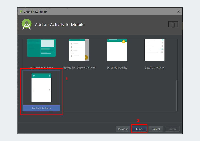
In the Add Activity to Mobile dialog, scroll down and select Tab Activity. Click the Next button after that.

In the last dialog, scroll down to the Navigation Style dropdown menu and select Action Bar Tabs (with ViewPager). Finally, click the Finish button to accept all the configurations. Android Studio has now helped us create a project with a tabbed activity. Really cool!

It is highly recommended that you study the generated code. In an existing Android Studio project, to use this template, simply go to File > Activity > Tabbed Activity. And follow the same steps as described earlier.

The templates included with Android Studio are great for simple layouts and building basic apps, but if you want to take your app further, you might want to consider some of the app templates available from Envato Market. They’re a huge time-saver for experienced developers, helping them cut out the hard work of building an app from scratch and focus their talents instead on the unique and specialized parts of creating a new app.
Conclusion
In this tutorial, you learned how to create a tabbed interface in Android using the TabLayout and ViewPager APIs from scratch. We also learned how to quickly and easily use Android Studio templates to create a tabbed interface. I highly recommend checking out the official material design guidelines for tabs to learn more about how to properly design and use tabs in Android.
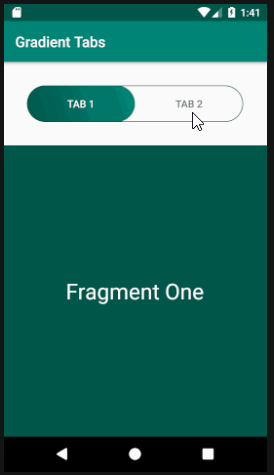
Recently I was tasked with creating a tab with gradient colored indicators. I have tried third party libraries and TabLayout Support Library to get the desired design, but to no avail. At one point I overrode the onDraw method to draw my own indicators using Paint shaders and LinearGradient, but found that the gradient was drawn to the TabLayout background instead of the indicators.
Eventually, I came up with the idea of creating a custom view with a drawable gradient and placing it on top of the Tab Layout and calculating the translation along the x-axis to “slide” it. For this article I have created a new Github project called GradientTabs and it looks like this:
- To achieve the desired tab view, we need the following:
- TabLayout with tabIndicatorColor set to null.
- A view with a gradient background, A ViewPager (we will use ViewPager.OnPageChangeListener to calculate the translation), And a FragmentPagerAdapter for the ViewPager.
- Let's start coding!
Library is needed
Add these two libraries to your app's build.gradle:
implementation 'com.android.support:appcompat-v7:28.0.0'
implementation 'com.android.support:design:28.0.0'
Drawables
The first is the background for the indicator, gradient_bg.xml:
<?xml version="1.0" encoding="utf-8"?>
<shape
    android:shape="rectangle"
    xmlns:android="http://schemas.android.com/apk/res/android">

    <corners android:radius="25dp"/>
    <gradient
        android:type="linear"
        android:angle="45"
        android:startColor="@color/colorPrimaryDark"
        android:endColor="@color/colorPrimary"/>
</shape>
Let's give our TabLayout a nice outline by creating a drawable called tab_bg.xml:
<?xml version="1.0" encoding="utf-8"?>
<shape android:shape="rectangle"
    xmlns:android="http://schemas.android.com/apk/res/android">
    <corners android:radius="25dp"/>
    <stroke android:color="@color/colorPrimaryDark" android:width="1dp"/>
    <solid android:color="#00000000"/>

</shape>
And finally our activity layout, activity_main.xml:
<?xml version="1.0" encoding="utf-8"?>
<LinearLayout xmlns:android="http://schemas.android.com/apk/res/android"
    xmlns:app="http://schemas.android.com/apk/res-auto"
    xmlns:tools="http://schemas.android.com/tools"
    android:layout_width="match_parent"
    android:layout_height="match_parent"
    android:orientation="vertical"
    tools:context=".MainActivity">

    <FrameLayout
        android:layout_width="match_parent"
        android:layout_height="wrap_content"
        android:padding="32dp"
        android:clipToPadding="false">

        <View
            android:id="@+id/indicator"
            android:layout_width="0dp"
            android:layout_height="50dp"
            android:background="@drawable/gradient_bg"/>

        <android.support.design.widget.TabLayout
            android:id="@+id/tab"
            android:layout_width="match_parent"
            android:layout_height="50dp"
            android:background="@drawable/tab_bg"
            app:tabGravity="fill"
            app:tabMode="fixed"
            app:tabSelectedTextColor="#ffffff"
            app:tabIndicatorColor="@null"
            app:tabRippleColor="@null"/>

    </FrameLayout>

    <android.support.v4.view.ViewPager
        android:id="@+id/viewPager"
        android:layout_width="match_parent"
        android:layout_height="match_parent"/>

</LinearLayout>
Note that the layout_width indicator is set to 0dp. We will set it at runtime with the measured width of the TabLayout divided by the number of tabs.
Code Logic
Let's start putting the pieces together. I've written a simple FragmentPagerAdapter and Fragment class to demonstrate that the custom indicator follows the scrolling motion:
<?xml version="1.0" encoding="utf-8"?>
<RelativeLayout xmlns:android="http://schemas.android.com/apk/res/android"
    android:layout_width="match_parent"
    android:layout_height="match_parent"
    android:background="@color/colorPrimaryDark">

    <TextView
        android:layout_width="wrap_content"
        android:layout_height="wrap_content"
        android:layout_centerInParent="true"
        android:textSize="30sp"
        android:textColor="#ffffff"
        android:text="Fragment One"/>

</RelativeLayout>
fragment_2.xml
<?xml version="1.0" encoding="utf-8"?>
<RelativeLayout xmlns:android="http://schemas.android.com/apk/res/android"
    android:layout_width="match_parent"
    android:layout_height="match_parent"
    android:background="@color/colorPrimary">

    <TextView
        android:layout_width="wrap_content"
        android:layout_height="wrap_content"
        android:layout_centerInParent="true"
        android:textSize="30sp"
        android:textColor="#ffffff"
        android:text="Fragment Two"/>

</RelativeLayout>
FragmentOne.kt
package com.example.gradienttabs;

import android.os.Bundle;
import android.support.annotation.NonNull;
import android.support.annotation.Nullable;
import android.support.v4.app.Fragment;
import android.view.LayoutInflater;
import android.view.View;
import android.view.ViewGroup;

public class FragmentOne extends Fragment {

    public static FragmentOne newInstance() {
        return new FragmentOne();
    }

    @Nullable
    @Override
    public View onCreateView(@NonNull LayoutInflater inflater, @Nullable ViewGroup container, @Nullable Bundle savedInstanceState) {
        View view = inflater.inflate(R.layout.fragment_one, container, false);
        return view;
    }
}
FragmentTwo.kt
package com.example.gradienttabs;

import android.os.Bundle;
import android.support.annotation.NonNull;
import android.support.annotation.Nullable;
import android.support.v4.app.Fragment;
import android.view.LayoutInflater;
import android.view.View;
import android.view.ViewGroup;

public class FragmentTwo extends Fragment {

    public static FragmentTwo newInstance() {
        return new FragmentTwo();
    }

    @Nullable
    @Override
    public View onCreateView(@NonNull LayoutInflater inflater, @Nullable ViewGroup container, @Nullable Bundle savedInstanceState) {
        View view = inflater.inflate(R.layout.fragment_two, container, false);
        return view;
    }
}
TabFragmet.kt
package com.example.gradienttabs;

import android.support.v4.app.Fragment;
import android.support.v4.app.FragmentManager;
import android.support.v4.app.FragmentPagerAdapter;

import java.util.ArrayList;
import java.util.List;

public class TabFragmentAdapter extends FragmentPagerAdapter {
    private final List<Fragment> fragmentList = new ArrayList<>();
    private final List<String> fragmentTitleList = new ArrayList<>();

    public TabFragmentAdapter(FragmentManager fm) {
        super(fm);
    }

    @Override
    public Fragment getItem(int i) {
        return fragmentList.get(i);
    }

    @Override
    public int getCount() {
        return fragmentList.size();
    }

    @Override
    public CharSequence getPageTitle(int position) {
        return fragmentTitleList.get(position);
    }

    public void addFragment(Fragment fragment, String title) {
        fragmentList.add(fragment);
        fragmentTitleList.add(title);
    }
}
And finally the logic for determining the translation:
package com.example.gradienttabs;

import android.os.Bundle;
import android.support.design.widget.TabLayout;
import android.support.v4.view.ViewPager;
import android.support.v7.app.AppCompatActivity;
import android.view.View;
import android.widget.FrameLayout;

public class MainActivity extends AppCompatActivity {

    TabLayout mTabs;
    View mIndicator;
    ViewPager mViewPager;

    private int indicatorWidth;

    @Override
    protected void onCreate(Bundle savedInstanceState) {
        super.onCreate(savedInstanceState);
        setContentView(R.layout.activity_main);

        //Assign view reference
        mTabs = findViewById(R.id.tab);
        mIndicator = findViewById(R.id.indicator);
        mViewPager = findViewById(R.id.viewPager);

        //Set up the view pager and fragments
        TabFragmentAdapter adapter = new TabFragmentAdapter(getSupportFragmentManager());
        adapter.addFragment(FragmentOne.newInstance(), "Tab 1");
        adapter.addFragment(FragmentTwo.newInstance(), "Tab 2");
        mViewPager.setAdapter(adapter);
        mTabs.setupWithViewPager(mViewPager);

        //Determine indicator width at runtime
        mTabs.post(new Runnable() {
            @Override
            public void run() {
                indicatorWidth = mTabs.getWidth() / mTabs.getTabCount();

                //Assign new width
                FrameLayout.LayoutParams indicatorParams = (FrameLayout.LayoutParams) mIndicator.getLayoutParams();
                indicatorParams.width = indicatorWidth;
                mIndicator.setLayoutParams(indicatorParams);
            }
        });

        mViewPager.addOnPageChangeListener(new ViewPager.OnPageChangeListener() {

            //To move the indicator as the user scroll, we will need the scroll offset values
            //positionOffset is a value from [0..1] which represents how far the page has been scrolled
            //see https://developer.android.com/reference/android/support/v4/view/ViewPager.OnPageChangeListener
            @Override
            public void onPageScrolled(int i, float positionOffset, int positionOffsetPx) {
                FrameLayout.LayoutParams params = (FrameLayout.LayoutParams)mIndicator.getLayoutParams();

                //Multiply positionOffset with indicatorWidth to get translation
                float translationOffset =  (positionOffset+i) * indicatorWidth ;
                params.leftMargin = (int) translationOffset;
                mIndicator.setLayoutParams(params);
            }

            @Override
            public void onPageSelected(int i) {

            }

            @Override
            public void onPageScrollStateChanged(int i) {

            }
        });
    }
}