NFT Collections")

a maniac collector @Joseinnewworld is back!
— Gaexe (@gaexe_) May 31, 2025
Thankyou for sweeping several of my #NFTs! 🙌
Your support means everything. Enjoy the perks, flex your collectible, and unlock the full Gaudio experience. 🎧💎 #eCash $XEC #BlockchainFuture #NFTdrop pic.twitter.com/s3cwnjJLv1
Hi dev, this time I want to discuss about parallax implementation for tabview header. What do you think is parallax? In my opinion, parallax is the art of transition between two different pages using animation.

Actually, this parallax technique has long been popular on the web platform, but recently many Android developers have been inspired by it and want to apply it to their mobile applications, so there's nothing wrong if I share an alternative solution without using third-party libraries.
You will soon find out that all of these needs are TabLayout. But hold your horses! I just entered TabLayout and this is what happened.
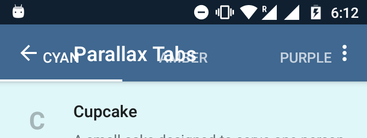
Unlike the usual TabView Material Design, here the Tab is transparent. So clearly, the plug and play solution does not work in this case.
It looks like it needs some tweaking. So before I paste the entire code, let's take a look at the layout framework.
<android.support.design.widget.CoordinatorLayout>
   <android.support.design.widget.AppBarLayout>
      <android.support.design.widget.CollapsingToolbarLayout>
         <ImageView />
         <android.support.v7.widget.Toolbar />
         <android.support.design.widget.TabLayout />
      </android.support.design.widget.CollapsingToolbarLayout>
</android.support.design.widget.AppBarLayout>
</android.support.design.widget.CoordinatorLayout>
CollapsingToolbarLayout is like FrameLayout. So pay attention to the order of the elements inside it. Whichever element you put last, is the one that appears on top. This positioning is important for parallax scrolling to work.
Also, it is the ImageView that enables parallax scrolling. We can tell it ImageView to have parallax scrolling with a single attribute. We will discuss this further later.
So now that you have an idea of the layout structure, take a look at this XML layout code.
<?xml version="1.0" encoding="utf-8"?>
<android.support.design.widget.CoordinatorLayout
    xmlns:android="http://schemas.android.com/apk/res/android"
    xmlns:app="http://schemas.android.com/apk/res-auto"
    android:id="@+id/htab_maincontent"
    android:layout_width="match_parent"
    android:layout_height="match_parent"
    android:fitsSystemWindows="true">

    <android.support.design.widget.AppBarLayout
        android:id="@+id/htab_appbar"
        android:layout_width="match_parent"
        android:layout_height="wrap_content"
        android:background="?attr/colorPrimary"
        android:fitsSystemWindows="true"
        android:theme="@style/ThemeOverlay.AppCompat.Dark.ActionBar">

        <android.support.design.widget.CollapsingToolbarLayout
            android:id="@+id/htab_collapse_toolbar"
            android:layout_width="match_parent"
            android:layout_height="256dp"
            android:fitsSystemWindows="true"
            app:contentScrim="?attr/colorPrimary"
            app:layout_scrollFlags="scroll|exitUntilCollapsed|snap"
            app:titleEnabled="false">

            <ImageView
                android:id="@+id/htab_header"
                android:layout_width="match_parent"
                android:layout_height="match_parent"
                android:background="@drawable/header"
                android:fitsSystemWindows="true"
                android:scaleType="centerCrop"
                app:layout_collapseMode="parallax"/>

            <View
                android:layout_width="match_parent"
                android:layout_height="match_parent"
                android:alpha="0.3"
                android:background="@android:color/black"
                android:fitsSystemWindows="true"/>

            <android.support.v7.widget.Toolbar
                android:id="@+id/htab_toolbar"
                android:layout_width="match_parent"
                android:layout_height="?attr/actionBarSize"
                android:layout_gravity="top"
                android:layout_marginBottom="48dp"
                app:layout_collapseMode="pin"
                app:popupTheme="@style/ThemeOverlay.AppCompat.Light"/>

            <android.support.design.widget.TabLayout
                android:id="@+id/htab_tabs"
                android:layout_width="match_parent"
                android:layout_height="wrap_content"
                android:layout_gravity="bottom"
                app:tabIndicatorColor="@android:color/white"
                app:tabSelectedTextColor="@android:color/white"
                app:tabTextColor="@color/white_70"/>

        </android.support.design.widget.CollapsingToolbarLayout>

    </android.support.design.widget.AppBarLayout>

    <android.support.v4.view.ViewPager
        android:id="@+id/htab_viewpager"
        android:layout_width="match_parent"
        android:layout_height="match_parent"
        app:layout_behavior="@string/appbar_scrolling_view_behavior"/>

</android.support.design.widget.CoordinatorLayout>
I know the code is very long. But it takes double the effort to try the parallax effect using Java. So, if you have recovered from the shock, let's see what happens in the code above.
Explanation
These are some of the attributes that make parallax scrolling work. Let's discuss them one by one.
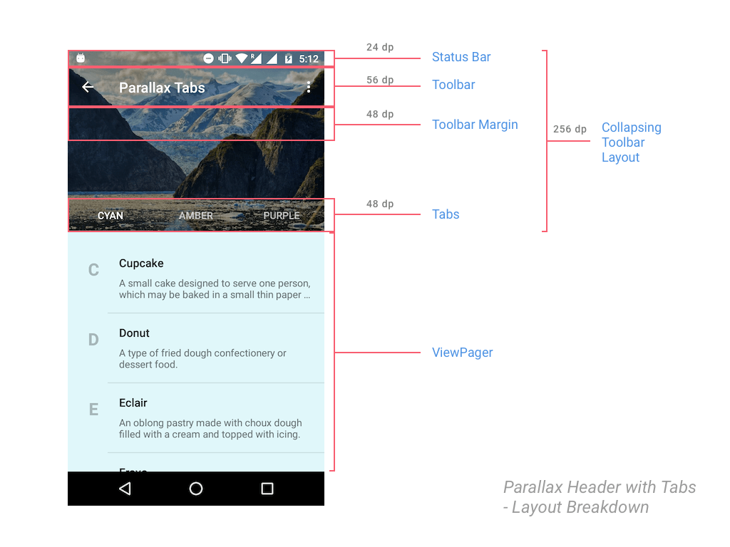
- 256dp is a good number for a collapsible header view.
- This is not a Flexible Space with Image pattern. We don't want the Toolbar title to collapse. We want it fixed at the top. So we disable the title
collapsible. - Flag that triggers the parallax effect when scrolling the page.
- Scrim that makes Tab text easier to read with a solid title background.
- Remember that
CollapsingToolbarLayoutis an extension ofFrameLayout. This attribute ensures thatToolbarit stays on top. - TabLayout defaults to a height of 48dp. Telling our Toolbar to have the same bottom margin, avoiding the overlapping issues we saw above.
- Make sure
Toolbarit's consistently pinned to the top. Otherwise, when you start scrolling,Toolbarit will scroll off-screen. - Make sure
TabLayoutit sticks to the bottom of the header.
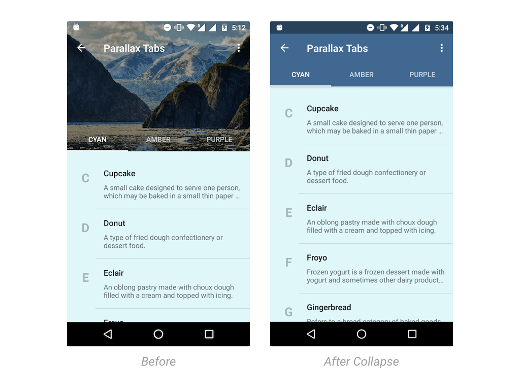
If you are still confused by the explanation points above, hopefully the visualization below can help provide a little enlightenment.
Setup ViewPager
In case you forgot, Tab requires ViewPager it to be used, so let's handle that in Activity.java.
Start by creating a dummy Fragment to display some content, Fragment just display it to start with RecyclerView.
Additionally, the background color Fragment will change depending on its position in ViewPager.
public static class DummyFragment extends Fragment {
int color;

        public DummyFragment() {
        }

        @SuppressLint("ValidFragment")
        public DummyFragment(int color) {
            this.color = color;
        }

        @Override
        public View onCreateView(LayoutInflater inflater, ViewGroup container, Bundle savedInstanceState) {
            View view = inflater.inflate(R.layout.dummy_fragment, container, false);

            final FrameLayout frameLayout = (FrameLayout) view.findViewById(R.id.dummyfrag_bg);
            frameLayout.setBackgroundColor(color);

            RecyclerView recyclerView = (RecyclerView) view.findViewById(R.id.dummyfrag_scrollableview);

            LinearLayoutManager linearLayoutManager = new LinearLayoutManager(getActivity().getBaseContext());
            recyclerView.setLayoutManager(linearLayoutManager);
            recyclerView.setHasFixedSize(true);

            DessertAdapter adapter = new DessertAdapter(getContext());
            recyclerView.setAdapter(adapter);

            return view;
        }
    }
Note that DummyFragment this is just a placeholder that I used with different background colors for each of my Tabs. DessertAdapter is RecyclerView.Adapter what I wrote to show scrollable content that can demonstrate the parallax effect.
On the other hand, you have to specify differentFragment the appropriate one, for each of your Tabs.
ViewPager Adapter
Minimalist adapter for ViewPager us (holds 3 Fragments).
private static class ViewPagerAdapter extends FragmentPagerAdapter {
        private final List<Fragment> mmFragmentTitleList FragmentList = new ArrayList<>();
        private final List<String> = new ArrayList<>();

        public ViewPagerAdapter(FragmentManager manager) {
            super(manager);
        }

        @Override
        public Fragment getItem(int position) {
            return mFragmentList.get(position);
        }

        @Override
        public int getCount() {
            return mFragmentList.size();
        }

        public void addFrag(Fragment fragment, String title) {
            mFragmentList.add(fragment);
            mFragmentTitleList.add(title);
        }

        @Override
        public CharSequence getPageTitle(int position) {
            return mFragmentTitleList.get(position);
        }
    }
Connecting ViewPager with TabLayout
Finally we will attach ViewPager to TabLayout the in method onCreate(). We use it OnTabSelectedListener to handle the Fragment redirection on click.
tabLayout.addOnTabSelectedListener(new TabLayout.OnTabSelectedListener() {
            @Override
            public void onTabSelected(TabLayout.Tab tab) {
                viewPager.setCurrentItem(tab.getPosition());
                switch (tab.getPosition()) {
                    case 0:
                        // TODO
                    break;
                }
            }
            @Override
            public void onTabUnselected(TabLayout.Tab tab) { }
            @Override
            public void onTabReselected(TabLayout.Tab tab) {}
});
Don't forget to fill the Adapter ViewPager with Fragment you. I added 3 Fragments to the Adapter, each with its own background color.
private void setupViewPager(ViewPager viewPager) {

    ViewPagerAdapter adapter = new ViewPagerAdapter(
                               getSupportFragmentManager());
    adapter.addFrag(new DummyFragment(
        ContextCompat.getColor(this, R.color.cyan_50)), "Cyan");
    adapter.addFrag(new DummyFragment(
        ContextCompat.getColor(this, R.color.amber_50)), "Amber");
    adapter.addFrag(new DummyFragment(
        ContextCompat.getColor(this, R.color.purple_50)), "Purple");
    viewPager.setAdapter(adapter);
}
The method setupViewPager() simply initializes it Fragment and adds it to ViewPager.
Dynamic Tab Colors with Palette API
The colors you see are taken by Toolbar + TabLayout, taken from the header image. Courtesy of the Palette API. It is dynamic and the colors vary depending on the image.
By using the Palette API, it is easier for us to set the colors Toolbar, TabLayout, and StatusBar.
try {
    Bitmap bitmap = BitmapFactory.decodeResource(getResources(), R.drawable.header);
    Palette.from(bitmap).generate(new Palette.PaletteAsyncListener() {
        @SuppressWarnings("ResourceType")
        @Override
        public void onGenerated(Palette palette) {

            int vibrantColor = palette.getVibrantColor(R.color.primary_500);
            int vibrantDarkColor = palette.getDarkVibrantColor(R.color.primary_700);
            collapsingToolbarLayout.setContentScrimColor(vibrantColor);
            collapsingToolbarLayout.setStatusBarScrimColor(vibrantDarkColor);
        }
    });

} catch (Exception e) {
    // if Bitmap fetch fails, fallback to primary colors
    Log.e(TAG, "onCreate: failed to create bitmap from background", e.fillInStackTrace());
    collapsingToolbarLayout.setContentScrimColor(
            ContextCompat.getColor(this, R.color.primary_500)
    );
    collapsingToolbarLayout.setStatusBarScrimColor(
            ContextCompat.getColor(this, R.color.primary_700)
    );
}
Note that calling the Palette API is actually done in a block try-catch. This is one of the best practices for handling errors. Here, the Palette API could fail if we couldn’t get a Bitmap. Instead, we use our application’s primary color.
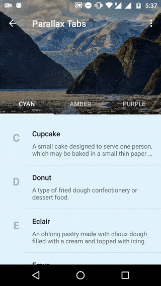
Final Output
With everything in place, run your app by scrolling through it and see how stunning the parallax header effect is.